Friday 18 October 2013

Visual Communication - 2D Design

Four disciplines within 2D Design are Illustration, Graphic Design, Animation and Textiles. 

Noma Bar 


Noma Bar uses block colour and negative space in his illustrations, which has an incredibly eye-catching effect. The above right image, "power to the individual", is a very simple design with bright, block colour, however the result is very striking. Not only is it the colour that draws attention, it is the very simple shapes in the piece. On first glance it just appears to be a pair of red boxing gloves, which is fitting to the title of the piece. However, after looking at the image again there seems to be a figure created out of the negative space of the gloves, the figure is posing in a position that displays strength and power, which again, relates to the title of the piece.

The above left image, "swimmer", is again, a fairly simple design with simple bright colour. As with the other piece, negative shape plays an important part as it creates the idea of water and a person swimming. Although the colour is the same across the image, there is still an impression of water and sky. The blue around the figure is curved, suggesting water, but the moon shape at the top and the stretched out arm of the figure also gives an idea of the sky, as the sky is often reflected in water which allows them to be the same colour. What I really like about Noma Bar's work is the way it manages to completely communicate and express meaning of the piece when only extremely simple colours and shapes are used.

Timorous Beasties

decouper-trois-panel-01.gif

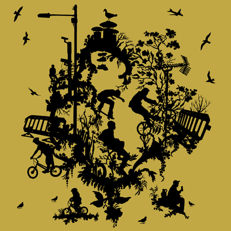
Timorous Beasties are a design company who create detailed wallpapers and fabrics. The image above is from a collection based on contemporary urban life. Using a simple colour two tone colour scheme, they have created a design that features silhouettes and outlines the content of the piece. What I really like about the piece above is the mixture of the contemporary, urban ideas, like the figures on bicycles and the lamp-posts, mixed with the very natural elements, like the birds and floral patterns. Floral patterns are a very common idea in this kind of 2D design, they are over-done and, in some regards, quite boring now. This is one of the reasons why I enjoy the piece above so much, as it mixes in this obvious idea with something more modern and something that is the antithesis to the floral, natural pattern.


This image is actually Timorous Beasties logo. However, I find it rather interesting, the monochrome colour scheme is bold and striking along the simple imagery. The use of negative space to outline the T and the insect allow the viewer to clearly recognise the company and is a memorable design,  whilst also demonstrating what they do as a company. Overall it is a very simple, yet effective design for a logo. 

Wednesday 16 October 2013

Circulation - 3D Design

As part of the 3D design block, we were given a word to use as a concept. I was given the word circulation.


My first idea involved the idea of the physical blood circulation through the body. I researched using anatomy books and used images from several magazines to help develop ideas and the theme I was working with. Using a mixture of wire, paper, masking tape, string and collage, I created a few structures that represented the idea of circulation through the body.


Saturday 12 October 2013

Photography pt.2

At college last week we had a go at directing and setting up some of our own photography. Looking at several artists and responding to their work, we were able to create some pretty successful photos in the style of the two artists below.

Thorsten Brinkmann


Our photos in the style of Thorsten Brinkmann;


Erwin Wurm


Our photographs in the style of Erwin Wurm; 


Wednesday 9 October 2013

3D Design

This week at college, we have been doing a 3D Design project, something I have found rather challenging as I have very little experience in creating any sort of 3 dimensional structure. Our task this week was to investigate the work of one artist or designer and create a response piece to their work. 

Kayo Saito


I found myself immediately drawn to Kayo Saito's work, especially the piece above. The delicate pieces of material combined with tiny pearls create a really pretty, elegant neckpiece. The little flower details have a natural quality about them, which is quite unusual considering they are made from polyester fabric, a very unnatural material. One element of Saito's work I am not a fan of is the colour used, as I find them too bright, however I find that I really like the dark tones of the piece pictured above, as it is quite understated and subtle.

Flora BroochesLayer Bracelets

Making a range of jewellery, from brooches to bracelets, Kayo Saito has gently and delicately, mainly working in polyester fabric and metal, has created jewellery which contrasts to the materials used as it looks as if it is mad from more natural materials. Aesthetically, it is very pleasing and unchallenging. However, in some ways it is too 'sweet' and in some regards, a little boring as a piece of jewellery. I personally wouldn't wear it, but I appreciate and enjoy the design process of the pieces.

Seed Pods Earrings

The earrings above by Kayo Saito are made from gold, and what I find particularly pleasing about this piece is the shape of the individual 'pods' that are linked together. The shape on its own is rather boring, but together it creates an interesting piece with many different levels and heights.

One of our tasks this week was to create a structure in response to the artists work, so I created this using paper and staples;


I used different coloured paper that also had different textures and created an asymmetrical cylinder-like shape, attaching them together using staples. Obviously using a material such as paper is a lot different to using metal and I am not that pleased with the outcome. However I have very little experience in the 3 dimensional area, so with practice I hope my skills will improve.

Nora Fok

Nora Fok


Noran Fok uses a a range of knitted nylons to create these beautiful, wearable constructions. These delicate compositions are intricate and gentle, and look almost like 3-dimensional drawings. 

They have similar aspects to Kayo Saito's work, the delicate flower piece resembles the above works be Nora Fok. I personally prefer Nora Fok's work, as not only does it seem more delicate, it also seems to have more imagination behind it and I find it much more interesting as a piece of art, as well as a wearable piece of jewellery. 

Wednesday 2 October 2013

Photography

Dorothea Lange


Crossroads Store (1939)

Dorothea Lange's photographs are seen as socially historical documents of the Great Depression. Photographing the homeless and poor, she captured important images that document the social effect of the Great depression and the effect it had on the people on the streets. Lange photographed what she saw, which creates really interesting, unplanned images that have more meaning than if they were arranged into a compostion.

"Hands Off! I do not molest what I photograph, I do not meddle, I do not arrange" - Dorothea Lange

Loretta Lux

back / zurück
Study of a Girl 2

Loretta Lux's photographs of children are quite surreal and odd. The image above is interesting to look at, on first glance it appears to be just a photo of a young child but there is something rather odd about it. I can't quite decide whether I like it or not, as there is something vaguely weird about it however I do like the fact it is a challenging image, as there is something quite uncomfortable about it, but it is really a rather straightforward photograph. 

Eadweard Muybridge

Woman Dancing (Fancy)

Using multiple cameras, Eadweard Muybridge created series of photographs depicting motion using a stop motion effect. He was the first to use the idea of stop motion, a style which is still used today. Each of the images above can be used on its own, but together they create an interesting series of a woman dancing and moving.