Sunday 22 September 2013

Expressive Movement

Maggi Hambling

Small Wave III 

There is so much movement in Maggi Hambling's work, the thick marks and bold use of colour really give the effect of a crashing wave. It is fully expressive and the marks really define the wave with different levels of weight or thickness. The negative shape behind the wave is important in creating the right shape of the wave, as without it, the movement and energy of the piece would be lost.

Frank Auerbach 


Even though it is a portrait, this piece by Frank Auerbach is also very expressive and full of movement. The thick brush strokes and marks going in all directions and layered over each other seem to describe the shapes and the feel of the image, as well as creating a portrait. 

John Virtue 


Famous Painters: John Virtue Painting

Saturday 21 September 2013

"Selfies"

I am not a fan of 'selfies'. I don't enjoy having my photograph taken by other people, so the thought of taking my own photo never crosses my mind and is something I would rather avoid. However this week at college, one of our tasks was to take some self-portraits. After some procrastination, I finally came round to the task and used to word 'movement' as the basis for my photographs. 

By moving and shaking my head when taking the photo, I was able to take a self-portrait with elements of distortion and movement and creating an overall more interesting image, rather than just a picture of my own face. 


I also tried some in black and white, to see the effects of taking away the colour and think this also provided an interesting image. Black and white imagery seems to create a much more serious feeling in the photograph and the effects are much more subdued in comparison to the full colour images.


For the last image, I tried taking the photo in a slightly different way, by only moving my mouth. I think this makes the image completely different, as the only moving, slightly distorted part is my mouth, and the rest of my face is in focus. My mouth seems to blend into my face and is blurred against the focused image, which presents an entirely different idea. 


Experimental Drawing

At college this week, we have been looking at experimental methods of drawing and mark making when exploring ideas. I have researched artists who use non-traditional methods of drawing to fully understand the concept of experimental drawing and approach it as a thought process in my own work.
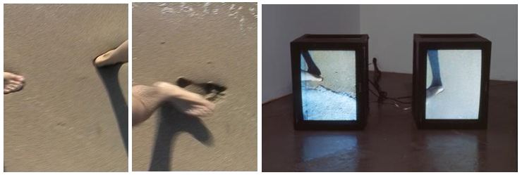

Jennifer West

still from 'One Mile Film' (2012)

By taking an old, unused film, Jennifer West creates something new, contemporary and exciting with the use of mark making. By 'damaging' and changing the condition of the film tape, she creates new films which seem to have a texture and many different layers to them. There is so much movement as the film and the marks over the top move together, but you are not detracted from the marks by the main film, rather they work together as one piece and the marks becomes part of the scenery.

Matthew Harris

Temple Notebook

Matthew Harris, using paper and collage, has created two abstract pieces, translating drawing on to the paper using marks, layering, and inks. I really like the textural quality of this work and the different marks involved. 

Julie Mehretu

Image
Renegade Delirium (2002)


In Mehretu's work, there are many layers consisting mainly of paint and drawn lines, with different colours, textures and shapes creating an abstract image. Mehretu adds to the paint using pencils, inks and pens, creating marks that represent architectural features that overlay each other to create a more abstract piece. 


At college, I did some experimental drawing of my own to help develop ideas and as part of my thought process and thinking skills. To begin with, I folded paper using different lines and directions to create an interesting shape and lines.  


studies from the folded paper using shoe polish and collage

masking tape, cotton thread and collage on paper

Close up images of the above study. 


Thread sewn into paper, electrical tape and collage

Close ups of the above study

Another task set for us at college was drawing with our eyes shut and only using touch as a means to describe what we were drawing onto the paper. In the image below, there are several studies of my face drawn using oil pastels and my sense of touch. This was a very difficult concept to understand, as it is difficult to be experimental with drawing when my previous work has been so controlled. 


Thursday 19 September 2013

Transform pt. 2

Nancy Spero

Myth (1990)

What I really like in this piece is the repeated and super-imposed prints spread across the paper and the different methods and mediums used to create it. Using collage and prints, Nancy Spero has captured the ideas and symbols of myths and juxtaposed them with modern representation for women. There is a vast mixture of cultural and mythological icons, placed next to and even over the top of the more modern 'fantasy' images of women. I not only think it's a very interesting idea and design, but also think that it is important culturally as a representation of women and the female form.

Roger Hiorns


Copper sulphate Chartres and Copper sulphate Notre Dame (1996)

Using copper sulphate, Roger Hiorns has transformed these two churches into something extremely unusual. The contrast between the gothic architecture and the bright, blue crystals almost gives it magical appearance, like it doesn't belong in this world, but rather a fantasy world. The blue crystals sparkle, which against the stone buildings, is extremely eye-catching and the main focus of the piece. It almost makes the architecture of the churches rather dull, in comparison to the naturally grown, uncontrolled copper sulphate.


Monday 16 September 2013

On a walk

Part of my foundation art and design course involves researching and collecting artists and their work, to help gather inspiration and a reference for my own work and the process of my ideas. This blog will be the record of the artists I discover, so I can easily navigate my ideas and explore new ways of working.
This week, my assignment involved walking and ideas of walking within art so I have collected the following appropriate artists.


Janine Antoni


Tightrope Walking
Touch (2000)

Janine Antoni practised tightrope walking for an hour a day until she was able to walk the line of horizon just in front of the house she grew up in. I think this is an interesting and playful way to approach the idea of using art within walking, as draws attention to the horizon, making it the central feature. It almost looks as if Janine Antoni is walking on the horizon line, which creates an impressive image and plays with the idea of composition and perspective.

Janine Antoni and Paul Ramirez Jonas

Janine Antoni also worked with Paul Ramirez Jonas to create a film in which they took turns walking behind each other and fitting in and destroying each others marks in the sand. I find this idea particularly interesting as it is a destructive but also quite a childish and playful method of working and interacting with the medium, since sand is easily manipulated. 

Hamish Fulton


Hamish Fulton is a self-described "walking artist", he states that he does not leave marks on his walks, but rather his walks leave marks upon him. 
“A walk has a life of its own and does not need to be materialized into a work of art.  An artwork cannot re-present the experience of a walk…I attempt to ‘leave no trace." Hamish Fulton


Sunday 15 September 2013

Transform

Fiona Rae


Fiona Rae's work attracted my attention immediately, her paintings are dramatic and full of energy and imagination, using vivid colours and abstract shapes. One of my favourite aspects of her work is the little features, such as the hearts that appear in the two images above. It adds an element of 'cuteness' and a cartoon-like feature to her work. Although both pieces above contain the same heart shape feature, they are quite contrasting images. The first is darker, whilst the second is brighter and in some says, it has a child-like imaginative quality exploding into a painting. I really like both pieces, as although they have contrasting elements, they both have a similar theme and are really strikingly expressive.  
  

Robert Rauschenberg

I really like the collage and layering element of this image. It seems to contain a collection of items and ideas in the one piece, which I find interesting, not only because of the textural features involved, but also as it makes you want to look closer and discover the ideas contained within the piece. 

I also like the image above, but prefer the previous piece. I like the layering of photographs and the different colours used, however I find the previous image much more expressive, as it is less controlled and this seems to lack the freedom of the first piece.

Yinka Shonibare

The use of clothing and textiles within art is not usually something that attracts my attention, however I find myself drawn towards Yinka Shonibare's work. In the piece above, I think I enjoy the mixture of the brightly coloured and patterned, Victorian styled dresses (which is a contrast in itself), in unusual, quite transgressive positions.