J.P. King


Cory Peeke

I really like this image by Cory Peeke. It is very aesthetically pleasing, the composition is particularly lovely and it has a seemingly simplistic style.
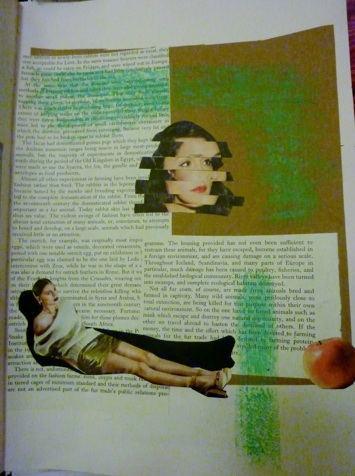
The artist's influence is evident in my own sketchbook work (images below). I used a range of media's, such as stitch, ink, collage, drawing and photocopying, to create my own small pieces, which I really enjoyed. There was something really fun about having the freedom to collect and plan out these pieces without having an exact brief to work with. As I am someone who prefers to work more freely, this section of the project was particularly enjoyable as I felt I could put together these small images using the range of media's without feeling constrained by a detailed plan.


The next part of this project was to create for luggage tags using the skills we have developed over the past few days. At first, I did set myself a vague brief just to get started and to formulate my ideas. I randomly picked the word 'travel' (not sure why, I think I picked up a map to work with and decided from there). As you can see from the image below, they are very loosely based on travelling and towards the end they started to go off the idea completely. This made me realise that working to a set brief is not really something I do naturally, as I seem to go off in other directions without realising.

No comments:
Post a Comment