Chair - unfinished
Sunday, 15 December 2013
Saturday, 30 November 2013
Document
our 5 week project is titled 'Document' - which is pretty good as it is such a broad topic.
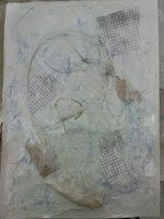
Our first task (to help us begin our thought process, after this we can do what we want) was to walk round chesterfield documenting something or a couple of things from this walk. I documented sounds of traffic and little bits of peoples conversations as they walked passed me. I also documented every time I saw the colour blue (104 times)
I did a few line drawings as well, but my main ideas were the sounds and the colour.
pages from my sketchbook from the walk
(sorry for the terrible quality - couldn't scan the pages in at home)
Thursday, 14 November 2013
Observational Drawing
Although they don't look like much, I find this kind of drawing really useful. A mixture of continuous line drawing, left-handed drawing and drawing with my eyes shut is a really effective way of understanding shape and playing around with composition and scale. Also, it's quite a fun task and most of the time I don't even realise I'm doing it, I'm just doodling in my notebook.
Wednesday, 6 November 2013
Faces
Yesterday we took part in the 'Big Draw', an annual event which supports and aims to encourage everyone to draw. We were given the title 'face to face' and our final result had to be some sort of mask, using a large paper bag as a base.
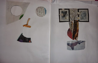
At first, we were told to use magazines to find images that could be used to make up a face, without using any facial images. This, at first, seemed rather difficult but once I started it it seemed obvious what shapes or images could be used to create a face. The two images below are studies from this task, what I like about these images is the completely random items used to make up the features (e.g. a mushroom for the nose, an upside-down mountain for a mouth). I think it really helped in developing ideas as it opens up new ideas/methods of creating a facial images without using typical imagery.
At first, we were told to use magazines to find images that could be used to make up a face, without using any facial images. This, at first, seemed rather difficult but once I started it it seemed obvious what shapes or images could be used to create a face. The two images below are studies from this task, what I like about these images is the completely random items used to make up the features (e.g. a mushroom for the nose, an upside-down mountain for a mouth). I think it really helped in developing ideas as it opens up new ideas/methods of creating a facial images without using typical imagery.
We also had the chance to do some photograms, something I had never done before. I really enjoyed creating them and find they are quite pleasing images even though they are made in a really simple way. Keeping with the 'face to face' theme, we made faces or facial features using random objects. This method creates some rather abstract images, I decided to take elements of facial features in these studies, rather than try and create an actual feature. In the first image (below), I wanted to make a whole face (although it doesn't quite look like one!). For the second two, I focused on the shapes and outlines of the eyes.
My finished piece (below left; front, below right;back). I took ideas from the collages I made previously (e.g the nose/eyebrows are like a plant) and then did some super-imposed blind and line drawings for the lips, using all the techniques I have learnt recently. I am not completely happy with the finished piece but I enjoyed the creating and development process, which I think is more important at this stage of the course.
Textiles/Surfaces - 2D Design
Dawn Dupree

Turbulence
Dawn Dupree is a contemporary textile artist and uses print, hand drawn image, mark making and photography in her work, layering them onto fabric creating a much more built up image. The multi-layered surfaces in her work, usually, has quite a bold colour as a base or theme which is striking, but isn't excessive. As images on a computer screen, it's hard to believe they are textile pieces, rather than just collage/more illustrative pieces on paper. Hand-drawing and printing onto different fabrics (e.g cottons, nylons, linen etc) must create different effects and different marks and I think that it adds something quite exciting to Dupree's work, as it is a more unusual and is a completely different base to paper, which is what I am familiar with.

Gary Hume

Water Painting (on aluminium panel)
I was instantly intrigued by this piece by Gary Hume as it reminded my of the line drawings and super-imposed drawing we have been doing at college recently. I enjoy continuous line drawing and doing quick, super-imposed sketches so this piece caught my attention immediately. I then found out it was painted using household paint on aluminium, which was interesting as I had never thought of using metal as a base for drawings like this before and also the type of surface aluminium is, very different to other, more common surfaces.
Monday, 4 November 2013
Visual Communication pt.3
J.P. King
Cory Peeke

I really like this image by Cory Peeke. It is very aesthetically pleasing, the composition is particularly lovely and it has a seemingly simplistic style.
The artist's influence is evident in my own sketchbook work (images below). I used a range of media's, such as stitch, ink, collage, drawing and photocopying, to create my own small pieces, which I really enjoyed. There was something really fun about having the freedom to collect and plan out these pieces without having an exact brief to work with. As I am someone who prefers to work more freely, this section of the project was particularly enjoyable as I felt I could put together these small images using the range of media's without feeling constrained by a detailed plan.
The next part of this project was to create for luggage tags using the skills we have developed over the past few days. At first, I did set myself a vague brief just to get started and to formulate my ideas. I randomly picked the word 'travel' (not sure why, I think I picked up a map to work with and decided from there). As you can see from the image below, they are very loosely based on travelling and towards the end they started to go off the idea completely. This made me realise that working to a set brief is not really something I do naturally, as I seem to go off in other directions without realising.
Visual Communication pt.2 - Fans
We were given several objects to work from on this part of the project. One of my objects was a fan, and I decided to focus on it in detail to see how far I could take it and to see how my ideas would develop when only using one item. Using collage, inks, and continuous line drawings I did a few samples in my sketchbook (below) looking at a colour scheme, what worked (and what didn't) and negative shapes as well as the shapes of the fan itself. All of these were done relatively quickly, which I quite enjoy as it you start working faster and thinking faster, which helps with the creative process.
My final three pieces were (at first) looking from the same angle but using different colour schemes to create a series. The third image, I decided to focus on the negative shapes more and leave it quite blank, in comparison to the other two, to see how it looked along side the other two, busier studies. I went over the pieces, doing all three at the same time, working back into them and doing continuous line drawings over the top of each other. Overall I am not entirely happy with them, but I think they work quite well as a series.
Friday, 18 October 2013
Visual Communication - 2D Design
Four disciplines within 2D Design are Illustration, Graphic Design, Animation and Textiles.



Noma Bar


Noma Bar uses block colour and negative space in his illustrations, which has an incredibly eye-catching effect. The above right image, "power to the individual", is a very simple design with bright, block colour, however the result is very striking. Not only is it the colour that draws attention, it is the very simple shapes in the piece. On first glance it just appears to be a pair of red boxing gloves, which is fitting to the title of the piece. However, after looking at the image again there seems to be a figure created out of the negative space of the gloves, the figure is posing in a position that displays strength and power, which again, relates to the title of the piece.
The above left image, "swimmer", is again, a fairly simple design with simple bright colour. As with the other piece, negative shape plays an important part as it creates the idea of water and a person swimming. Although the colour is the same across the image, there is still an impression of water and sky. The blue around the figure is curved, suggesting water, but the moon shape at the top and the stretched out arm of the figure also gives an idea of the sky, as the sky is often reflected in water which allows them to be the same colour. What I really like about Noma Bar's work is the way it manages to completely communicate and express meaning of the piece when only extremely simple colours and shapes are used.
Timorous Beasties

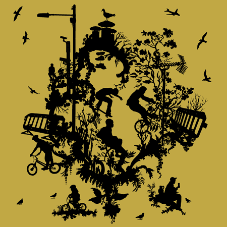
Timorous Beasties are a design company who create detailed wallpapers and fabrics. The image above is from a collection based on contemporary urban life. Using a simple colour two tone colour scheme, they have created a design that features silhouettes and outlines the content of the piece. What I really like about the piece above is the mixture of the contemporary, urban ideas, like the figures on bicycles and the lamp-posts, mixed with the very natural elements, like the birds and floral patterns. Floral patterns are a very common idea in this kind of 2D design, they are over-done and, in some regards, quite boring now. This is one of the reasons why I enjoy the piece above so much, as it mixes in this obvious idea with something more modern and something that is the antithesis to the floral, natural pattern.
This image is actually Timorous Beasties logo. However, I find it rather interesting, the monochrome colour scheme is bold and striking along the simple imagery. The use of negative space to outline the T and the insect allow the viewer to clearly recognise the company and is a memorable design, whilst also demonstrating what they do as a company. Overall it is a very simple, yet effective design for a logo.
Wednesday, 16 October 2013
Circulation - 3D Design
As part of the 3D design block, we were given a word to use as a concept. I was given the word circulation.
My first idea involved the idea of the physical blood circulation through the body. I researched using anatomy books and used images from several magazines to help develop ideas and the theme I was working with. Using a mixture of wire, paper, masking tape, string and collage, I created a few structures that represented the idea of circulation through the body.
Saturday, 12 October 2013
Photography pt.2
At college last week we had a go at directing and setting up some of our own photography. Looking at several artists and responding to their work, we were able to create some pretty successful photos in the style of the two artists below.


Thorsten Brinkmann

Our photos in the style of Thorsten Brinkmann;
Erwin Wurm

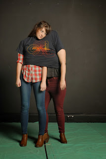
Our photographs in the style of Erwin Wurm;
Subscribe to:
Comments (Atom)


